An In-Depth Guide To the New Access Mobile Coupon App
Access was the first discount program in the world to launch a mobile coupon network and app, My Deals Mobile. In the beginning, people were only just coming around to the idea of mobile coupons. We saw it as an early opportunity to earn our clients some brand face time on mobile devices.
To this point the mobile coupon network and app have been a huge success. Maybe even bigger than we imagined, as usage and redemptions continue to climb on a daily basis.
Today people aren't just curious about mobile coupons - they're redeeming billions of them annually. Simply having mobile coupons isn't enough. To stay relevant, you have to know what deals people are looking for, and get them to those deals as quickly as possible.
With this speedy relevance in mind, we're proud to introduce the next generation of mobile coupon apps with the new My Deals Mobile.
Giving People the Offers They Want
We've configured this version to help people find the most relevant, exciting local offers within seconds.
Our network has over 500,000 merchant locations, but what matters is giving the user the right offer at the right time. That's what this app is designed to do.
Because of that efficiency in helping people save money, we think it's going to be a powerful mobile engagement tool for our clients, who use our programs for member benefits, incentives, employee perks, appreciation gifts, and more.
Want to see it?
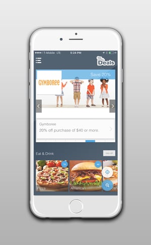
Here's a look at what's new and improved in the newest version of My Deals Mobile by Access Development:
The new My Deals Mobile encompasses hundreds of improvements, all designed to get users to the deals they're going to be excited about. Here are the most significant changes our clients and users will notice:
Email registration
Users can now login using their email addresses, as registered through the client group. Even if they're not registered through the client yet, they can set up an account in less than a minute.
 Tutorial
The first time a user logs in, they'll be guided through our new step-by-step tutorial. The app is intuitive on its own, but we want people to become experts. They're more likely to make it a habit that way, after all.
Home screen
Every time a user opens the app, they'll land here. This page highlights popular offers, as well as suggestions based on their current location. The page won't just highlight restaurants - it'll suggest pizza, or Mexican, or desserts. It'll point the user to new places to discover nearby, luxury brands, popular offers, and more.
Search from Anywhere
My Deals Mobile now includes a floating search button that an be triggered from anywhere in the app. Next to it is a compass button that will refresh the current page with content from the user's location.
Navigation
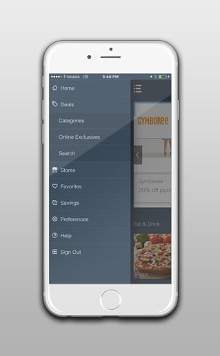
You'll notice a navigation bar on the left of the app. From this menu the user can pull up a list of offers and stores, their favorites, their savings calculator, preferences, help, and more. This menu can be accessed any time by swiping left to right from the edge of the screen, or by selecting the icon on the home page.
 Landscape and Portrait Viewing
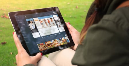
One of the most requested features from users, My Deals Mobile now adjusts to landscape as well as portrait viewing on your device. We think it renders especially lovely on an iPad.
Expanded Redemption Options
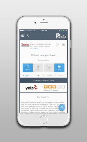
Most of our mobile coupons can be redeemed by showing your phone at the point of sale. But we also have some that are redeemed online, by phone, or by printing a coupon. All of these options can be accessed directly from the merchant offer page.
Yelp Integration
Curious about that new restaurant in town with the 25% off offer? See how the Yelp community rates it on the offer page, or click through to be taken directly to their reviews.
Filters
 While browsing offers, users will notice a new bar of options across the top of the screen. These filters let you slice and dice the offers as you see fit. For example, you can show a screen of only new offers, or only "show your phone" redemption offers. You can combine filters, if you wanted only to see restaurants with new offers within 10 miles of your current location, for example.
Expanded Favorites
Previously we allowed users to save their favorite locations (or individual stores). Now they save individual offers, stores, and even brands.
As you can see we've made it easy to find local savings. And we've given power users the tools they need to get precisely the offers they're interested in.
What hasn't changed
Now that you've seen some of our changes, here's what hasn't changed, and never will:
500,000+ Merchant Locations and Growing
Why is Access different from every other discount program in the marketplace is our dedication to working directly with local merchants? We work with 500,000 restaurants, retailers, auto shops, hotels, golf courses, amusement parks, and more. Many of them are popular national brands, but even more are the places in your neighborhood.
The Clients Come First
My Deals Mobile was made to create engagement between our clients and their customers, members, and/or employees. We don't splash the Access label all over the app because we want our clients to have that positive engagement. That's not changing, and every improvement we make to the app is designed to build that engagement.
We'll Handle the Hard Parts
The app has changed, but the people behind it haven't. Access is still dedicated to answering all user questions and concerns. When an issue with a merchant or the app comes up, we'll take care of it, every time.
Have questions? Want to test drive the new app for yourself? Contact us here, or just click the banner below to request a free trial.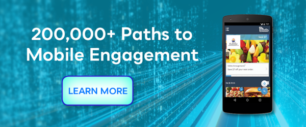
Topics: News
Written by: Brandon Carter

.jpg)
.jpeg)


Share your Comment.